
Towards the end of last week I came across a tweet by Jesse Stommel the tweet read:
Join me by writing some 4-word pedagogy statements. 🙂 https://twitter.com/jessifer/status/726424167420145664 …#4wordpedagogy
You can read about this in a bit more detail in his Storify
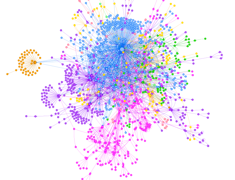
Over 4000 tweets later #4wordpedagogy has become a bit of a phenomenon, so I thought I would start capturing it visually.
Below is a gallery of images based on some of the data, but I have also been experimenting with Tableau as part of some visualisation work on a paper I am writing.
Tableau allows me to embed the data into a web page like this:
If you are having trouble viewing the embedded data you can access it here: https://public.tableau.com/views/4epedagogy/Sheet1?:embed=y&:display_count=yes&:showTabs=y
The larger the circle the more tweets associated with that twitter user.
I am hoping that this means the data is now less “static”. In this data model I have merely extracted the number of mentions each person has received based on the #4wordpedagogy hashtag activity. Roll your mouse over the circles to find out who they are.
You can also see a list of twitter users on the left. Scroll down to see them all, and this is also the key to the colour coding.
The static images I have previously shared are also below: (Data set as of 2nd May 2016).

No responses yet